


While developing PascoHub, an app for past examination questions, we realized the importance of incorporating a download progress animation to maintain user engagement during file downloads. This led us to explore different ways to create a download progress animation. In this article, I will guide you through the process of creating the animation step by step, and by the end, you will have a fully functional download progress animation integrated into your Flutter app.
Creating the download animation
To save time, I have provided a starter code below and a quick explanation of it.
//main.dart
import 'package:flutter/material.dart';
import 'package:flutter/scheduler.dart';

import 'fadein_widget.dart';

void main() {
  runApp(const MyApp());
}

class MyApp extends StatefulWidget {
  const MyApp({super.key});

  @override
  State<MyApp> createState() => _MyAppState();
}

class _MyAppState extends State<MyApp> with SingleTickerProviderStateMixin {
  late AnimationController _animationController;
  late Animation<double> _animation;
  final bool _isDownloading = false;
  final bool _isCompleted = false;
  late Ticker _ticker;
  final double _progress = 0.0;
  double iconSize = 200;
  double circularSize = 200;
  final iconColor = Colors.cyan;
  final circularBgColor = Colors.cyan.shade50;
  final circularColor = Colors.cyan;

  @override
  Widget build(BuildContext context) {
    return MaterialApp(
      theme: ThemeData(
          scaffoldBackgroundColor: Colors.white,
          useMaterial3: true,
          brightness: Brightness.light,
         ),
      debugShowCheckedModeBanner: false,
      home: Scaffold(
        appBar: AppBar(
          title: const Text('Download Progress Animation'),
        ),
        body: const SizedBox(),
      ),
    );
  }
}
Explanation
_animationController: It is anAnimationControllerobject responsible for controlling the animation. It defines the duration and other properties of the animation._animation: It is anAnimation<double>object that represents the current state of the animation. It is created using aTweenand is controlled by the_animationController. It specifies the range of values the animation will interpolate between._isDownloading: It keeps track of whether the download is in progress or not._isCompleted: It keeps track of whether the download is completed or not._ticker: It is aTickerobject responsible for calling the provided callback at regular intervals. In this code, it is used to update the_progressvalue based on the current value of the_animationController._progress: It is a double value between 0 and 1 that represents the current progress of the download. It is updated based on the value of the_animationController.
Follow the steps below to create the animation:
Inside the
main.dartfile, locate the_MyAppStateclass.Create an
initState()method. This method is called when the stateful widget is inserted into the tree for the first time.@override void initState() { super.initState(); // Add initialization code here }Inside the initState() method, create a Ticker object to update the progress of the animation.
 _ticker = Ticker((elapsed) {
   setState(() {
     _progress = _animationController.value;
   });
 });
 _ticker.start();
Create an AnimationController object to control the animation. This object will handle the duration and other settings of the animation.
 _animationController = AnimationController(
   duration: const Duration(seconds: 10),
   vsync: this,
 );
Create an animation using the Tween and CurvedAnimation classes. This animation will control the value of the progress indicator.
 _animation = Tween<double>(begin: 0, end: 1).animate(
   CurvedAnimation(
     parent: _animationController,
     curve: Curves.linear,
   ),
 );
Add a status listener to the animation controller to detect when the animation has been completed.
 _animationController.addStatusListener((status) {
   if (status == AnimationStatus.completed) {
     setState(() {
       _isCompleted = true;
     });
   }
 });
Dispose to clean up resources when the widget is removed from the tree.
 @override
 void dispose() {
   _ticker.stop();
   _animationController.dispose();
   super.dispose();
 }
Implement the _onDownloadPressed() method to initiate the animation when the download button is pressed.
 void _onDownloadPressed() {
   setState(() {
     _isDownloading = true;
   });
   _animationController.forward();
 }
Customize the widget's appearance by adjusting the values of
iconSize,circularSize,iconColor, andcircularBgColor.In the
build()method, update the widget tree to display the appropriate UI based on the animation state and progress.If the download is completed, show a fade-in widget with a checkmark icon. The code for fading-in a widget can be found here.
If the download is in progress, use an
AnimatedBuilderwidget to animate the circular progress indicator and display the progress percentage.If the download hasn't started, show the download icon.
body: Center(
child: _isCompleted
? FadeInWidget(
child: Icon(
Icons.download_done_rounded,
size: iconSize,
color: iconColor,
),
)
: _isDownloading
? AnimatedBuilder(
animation: _animation,
builder: (context, child) {
return Stack(
alignment: Alignment.center,
children: [
SizedBox(
height: circularSize,
width: circularSize,
child: CircularProgressIndicator(
strokeWidth: 15,
color: circularColor,
backgroundColor: circularBgColor,
value: _animation.value,
),
),
Text(
'${(_progress * 100).round()}%',
style: TextStyle(
fontSize: 32, color: Colors.cyan.shade600),
),
],
);
},
)
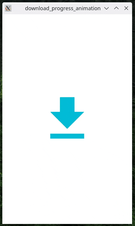
: GestureDetector(
onTap: _onDownloadPressed,
child: Icon(
Icons.download,
size: iconSize,
color: iconColor,
)),
),
Demo 🎉
Linear Progress
If you want the progress to be in a linear format, here's how you can do it:
replace the AnimatedBuilder in the body with the code below
    AnimatedBuilder(
                    animation: _animation,
                    builder: (context, child) {
                        return Padding(
                              padding: const EdgeInsets.symmetric(horizontal: 12.0),
                       child: Stack(
                            alignment: Alignment.centerRight,
                         children: [
                            LinearProgressIndicator(
                                  minHeight: 60,
                                color: circularColor,
                               backgroundColor: circularBgColor,
                                value: _animation.value,
                                  ),
                           Text(
                                    '${(_progress * 100).round()}%',
                                    style: TextStyle(
                                        fontSize: 32, color: Colors.cyan.shade600),
                                  ),
                                ],
                              ),
                            );
                          },
                        )
Demo 🎉
The complete code can be found here.
Conclusion
By following the steps given in this article, you learned how to use the provided code to create a download progress animation. This was all accomplished without the use of any third-party packages.
Feel free to play around with the code and modify it to meet your specific needs. You can adjust the animation duration, colors, curve, and UI elements to match the design of your app.
Happy coding!